Compass— Agent Brand Refreshes
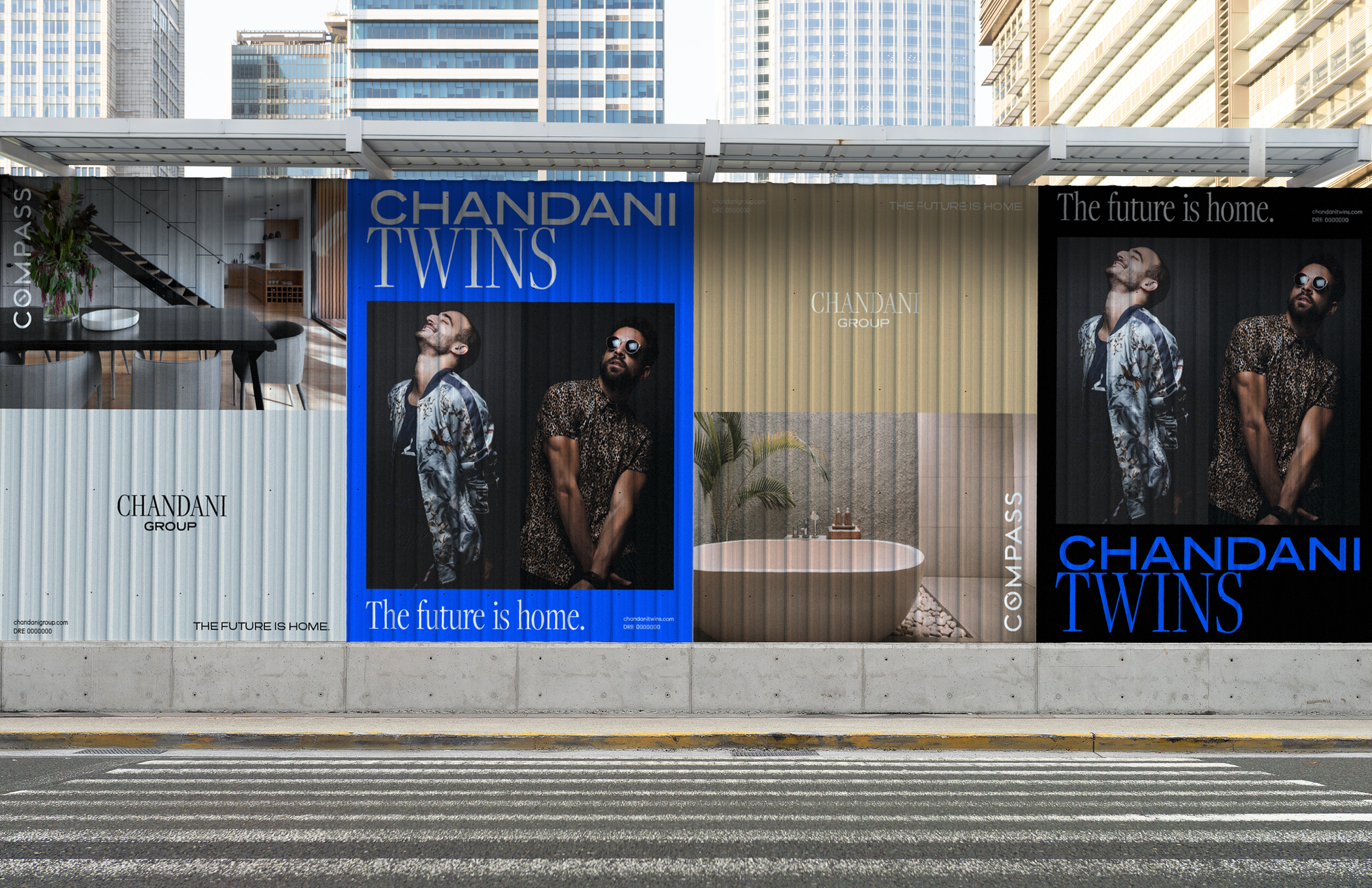
At Compass, a significant portion of the in-house team was focused on supporting our agents and their individual brands. While each agent operates under the broader Compass umbrella, they each represent a distinct identity, tailored to their own clientele. This dynamic presents a unique challenge: how do you successfully align a corporate brokerage’s brand with the personalized brand of each agent or team?
Here are a few of my favorite examples of how we achieved this dichotomy:
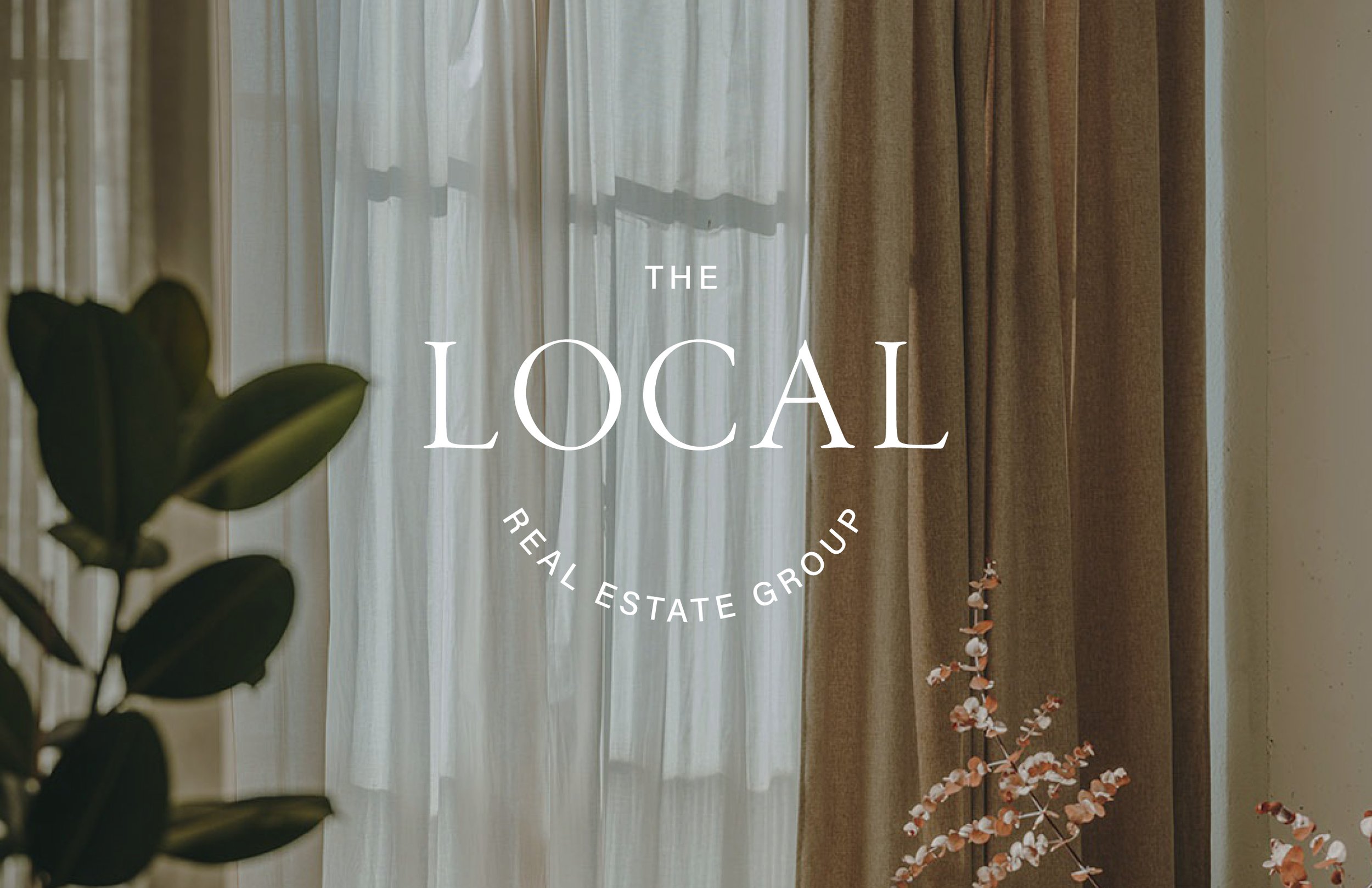
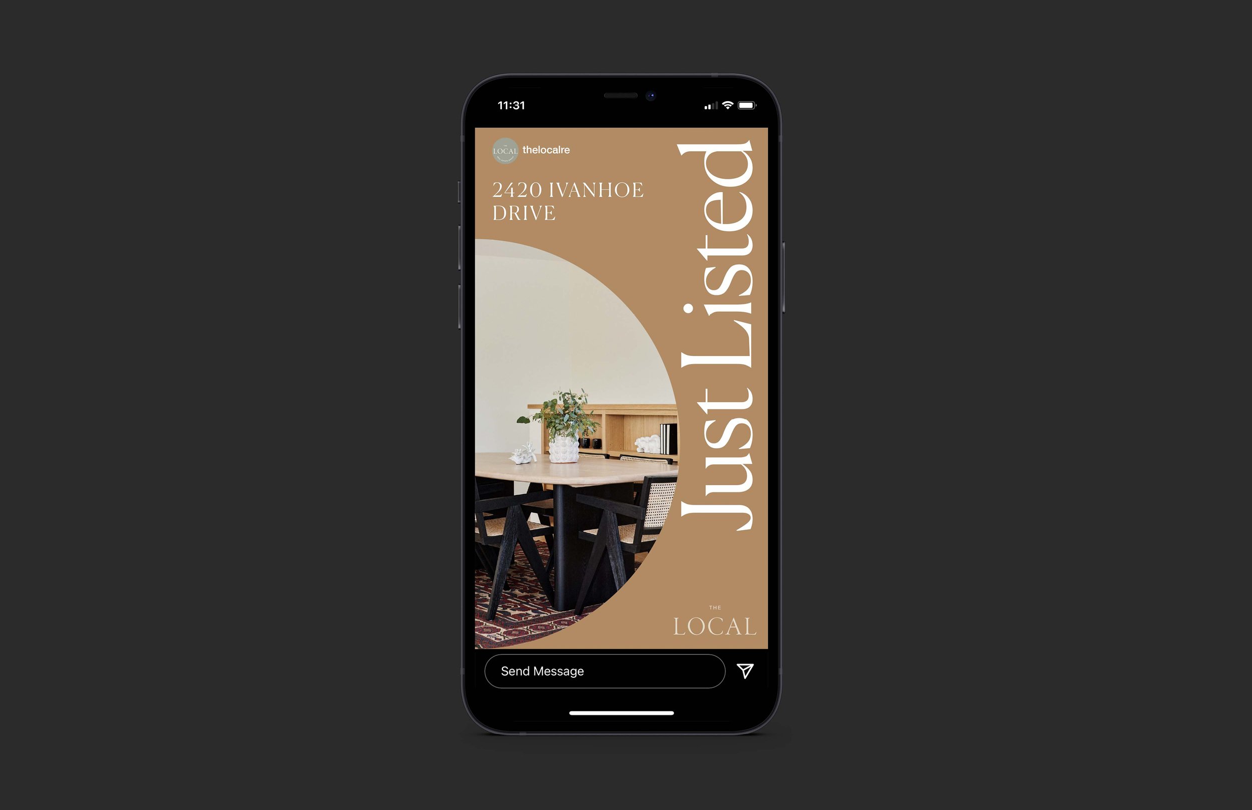
THE LOCAL REFRESH
CHANDANI REFRESH
SENIOR DESIGNER + ASSOCIATE DESIGN DIRECTOR
SEPTEMBER 2018-JANUARY 2023
DESIGNED AT COMPASS.COM
We’re not just experts. We’re locals.
The Local Real Estate Group has assembled an incredible team of specialists who put their all in everything they do for their clients and the Northeast Los Angeles communities. They wanted a brand that displayed their sense of personality and hinted at their community involvement. The shapes and color palette used throughout their brand are warm, inviting and playful.
-
Brand Identity
Visual Design
Creative Direction
Storefront Design
Vehicle Wrap
Print Collateral
Digital Social Templates -
Design Lead: Erin Dooney
Design Team: Garret Stieder, Leslie Wilkins


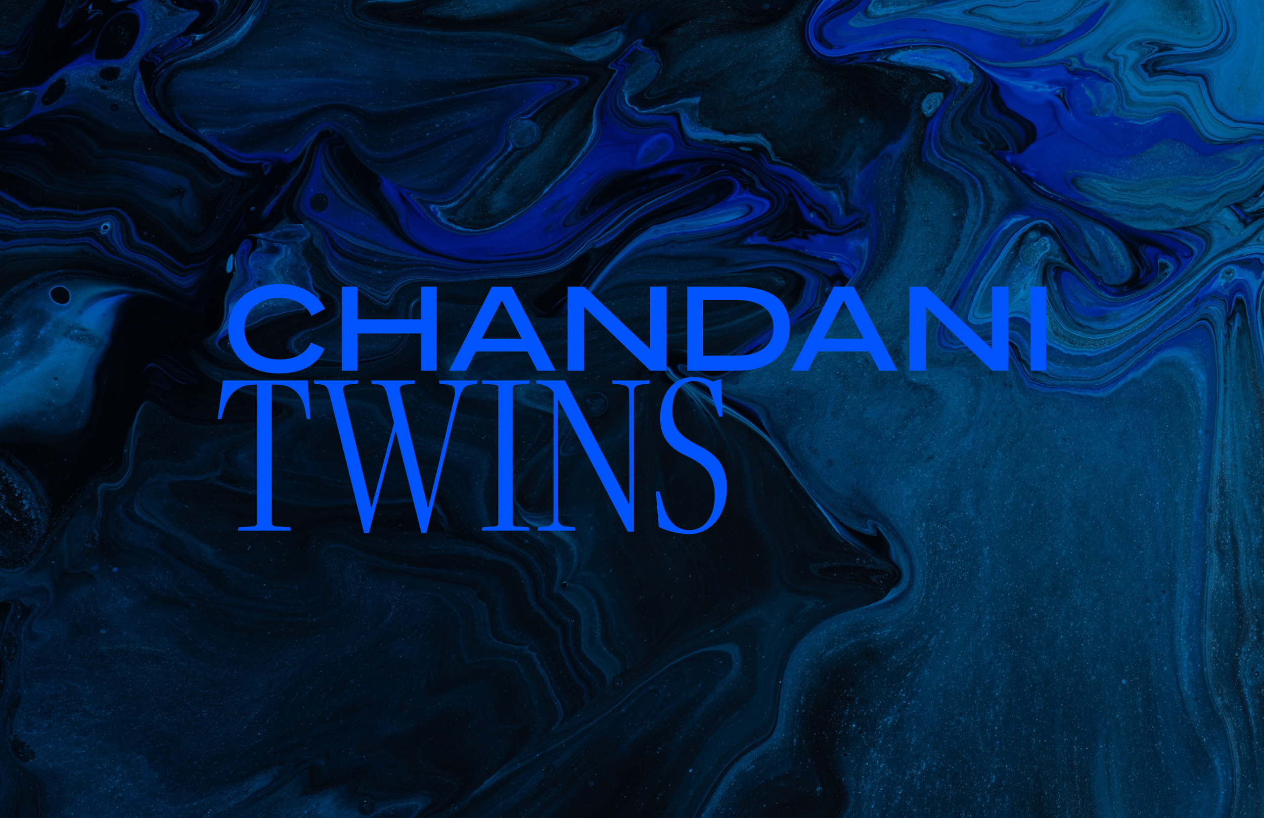
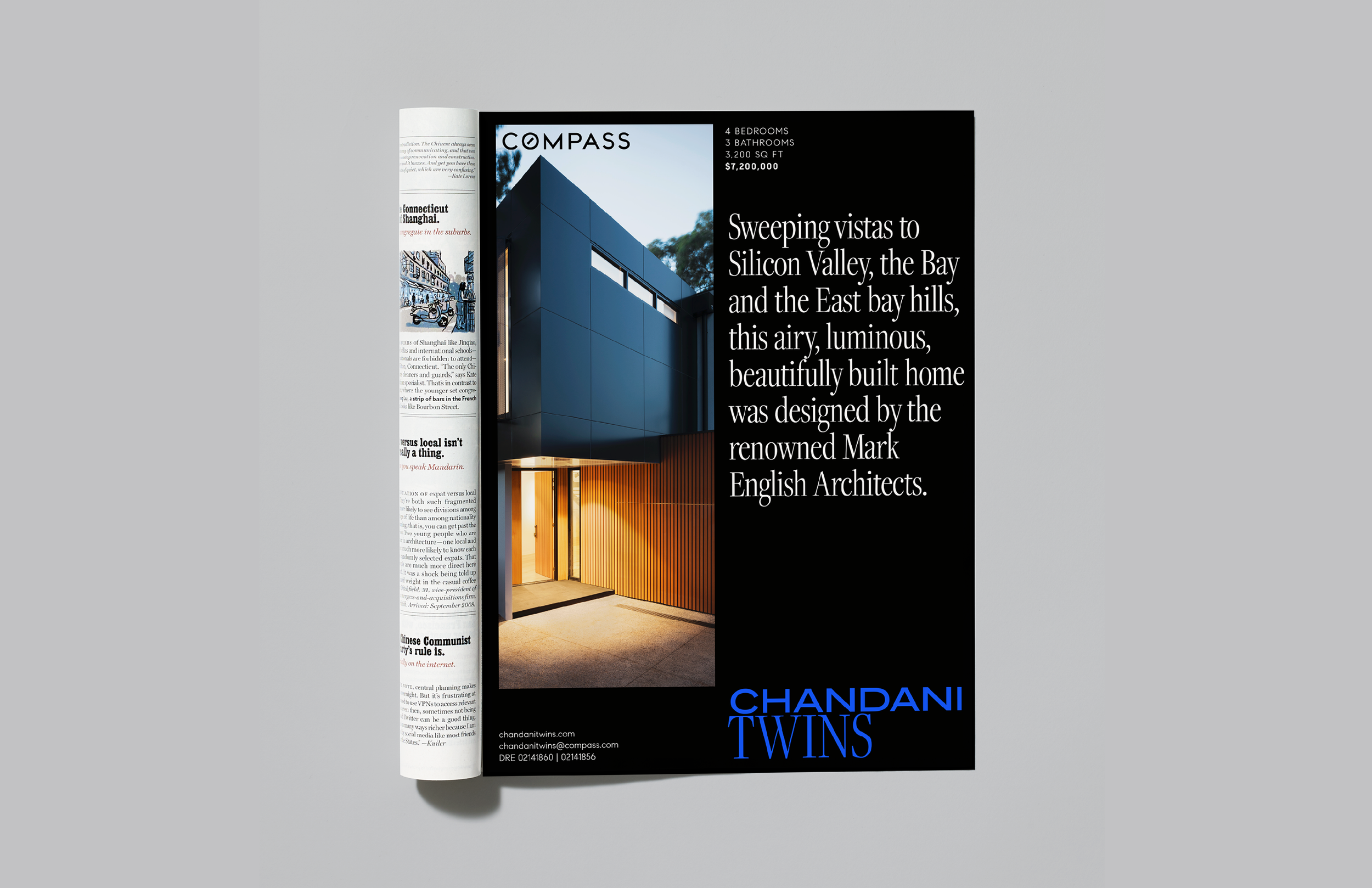
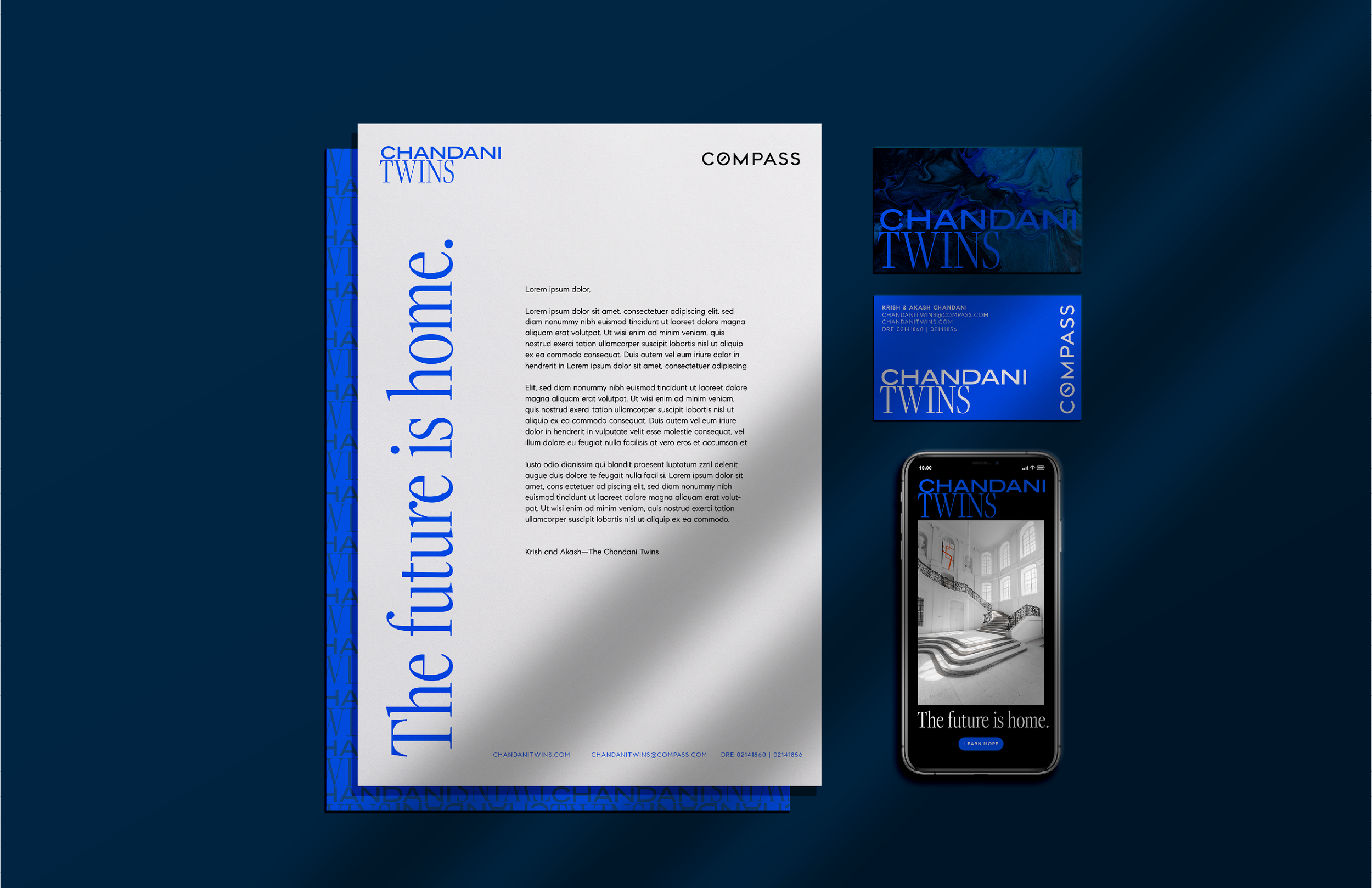
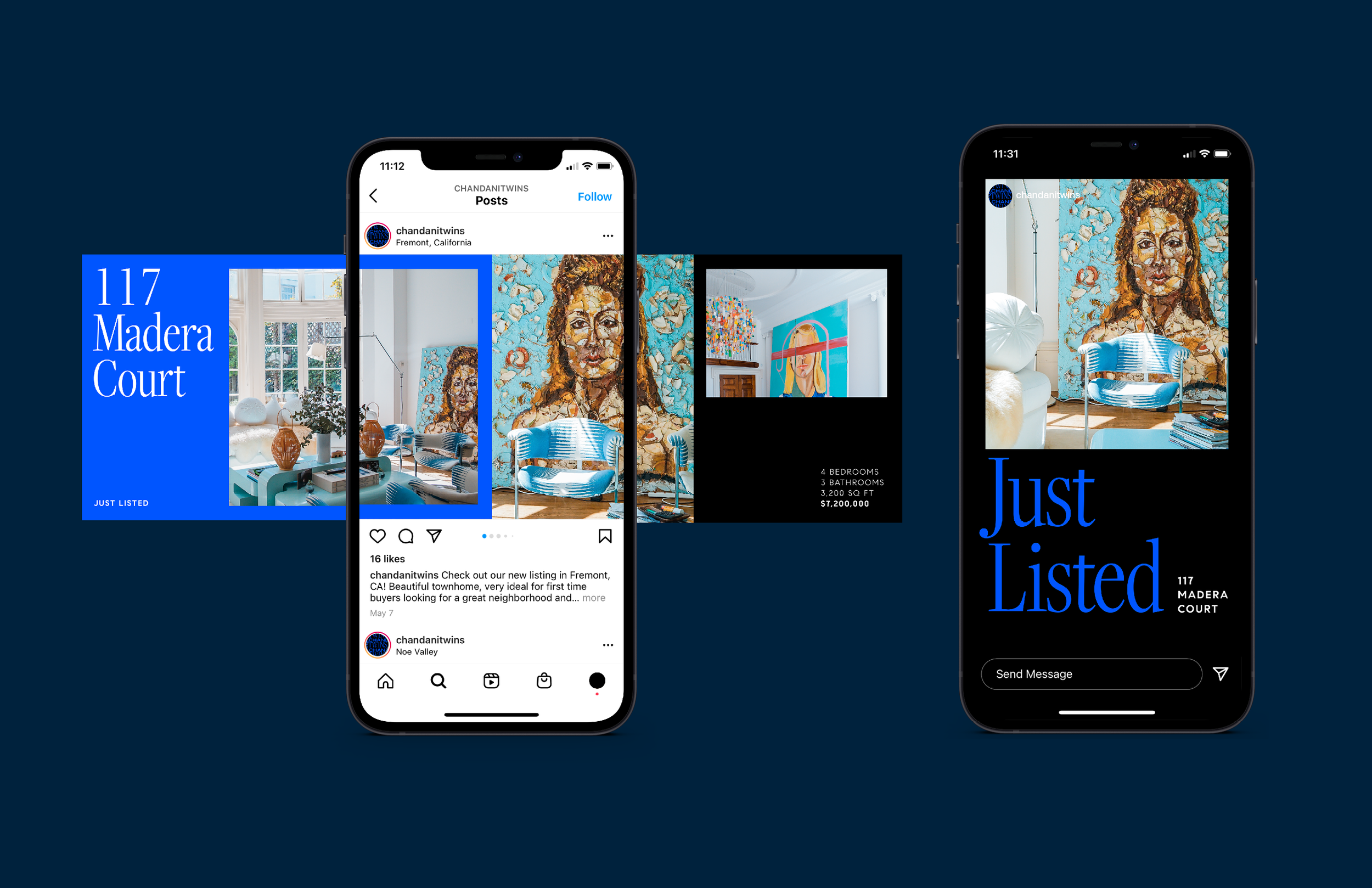
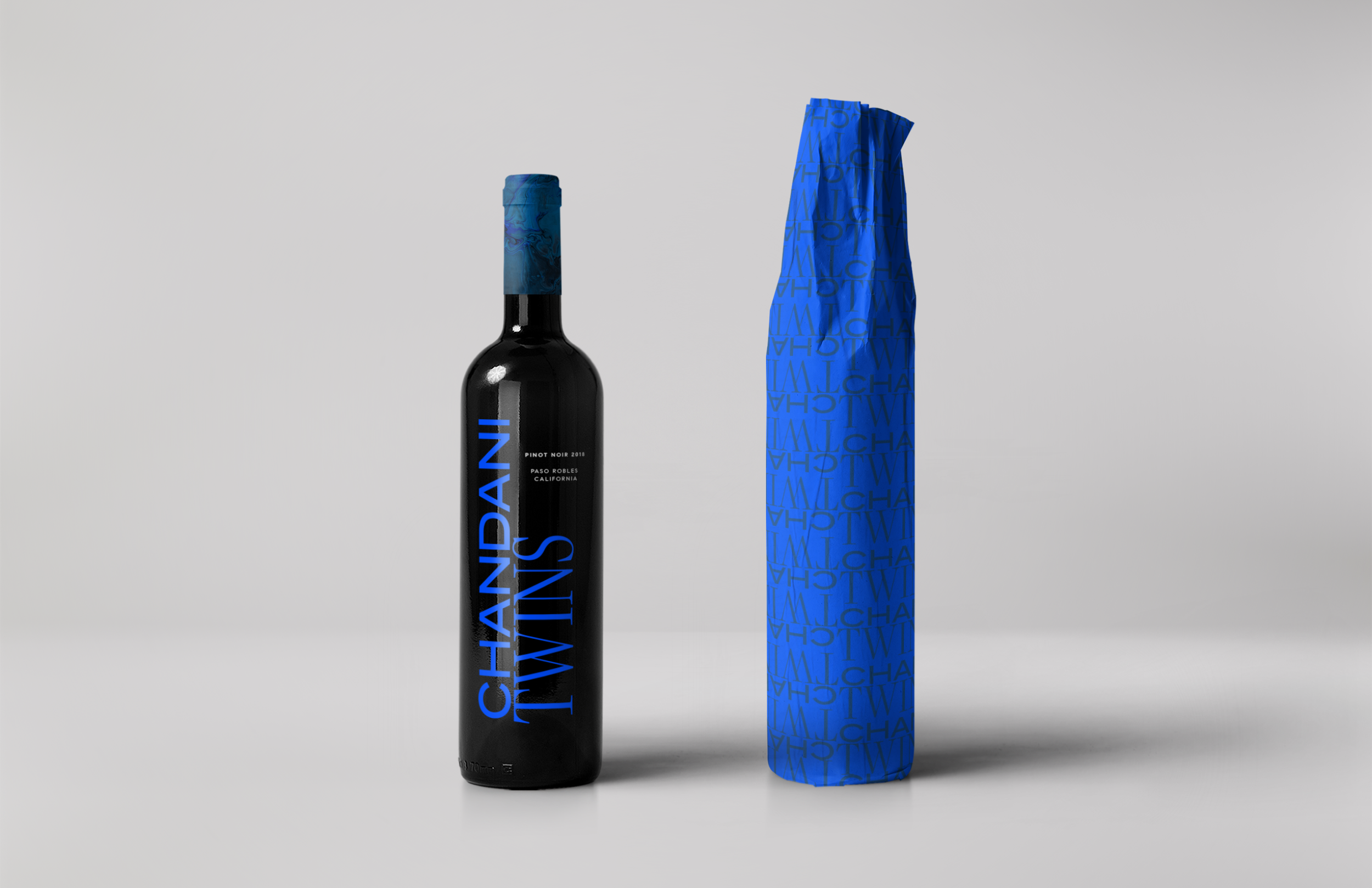
The Moonlight
Identical twins, Krish (Luv) & Akash (Kush) grew up in the family real estate and construction business. In just a few years, the twins were involved in over 100+ transactions and over $200 Million in sales.
The inspiration of their brand identity stemmed from the origins of Chandani meaning “moonlight”. Using modern typography as a basis for their logo mark, the Chandani Twins brand appeals to their young, tech savvy clientele in the San Francisco Bay Area.
-
Creative Direction
Brand Identity
Social Campaign
Print Ad
Package Design -
Project Lead: Leslie Wilkins
Design Direction: Leslie Wilkins
Design Team: Garrett Steider